
Color Theory: Monochromatic and Analogous Colors

CTMH has a great post today featuring several of the current sale items. “…Monochromatic color designs make use of a single color that varies in lightness and saturation. This type of color “combination,” if you will, is easy to achieve with some of our favorite Close To My Heart products. Take our two-toned Bashful cardstock, for example. We have Bashful on one side and light Bashful on the other. Because they are two tones of the same color, when used together they are considered monochromatic. Second generation stamping, where you stamp an image a second time without applying more ink to get a lighter image, is another way to play with monochromatic colors in your art.


Sometimes, a piece of artwork that we may think is monochromatic is actually following an analogous scheme, which is just a fancy way of saying that the featured colors are next to each other on the color wheel. One color is typically dominant while neighboring colors are used to enhance the design. In our example layout above, we make use of both monochromatic and analogous colors.
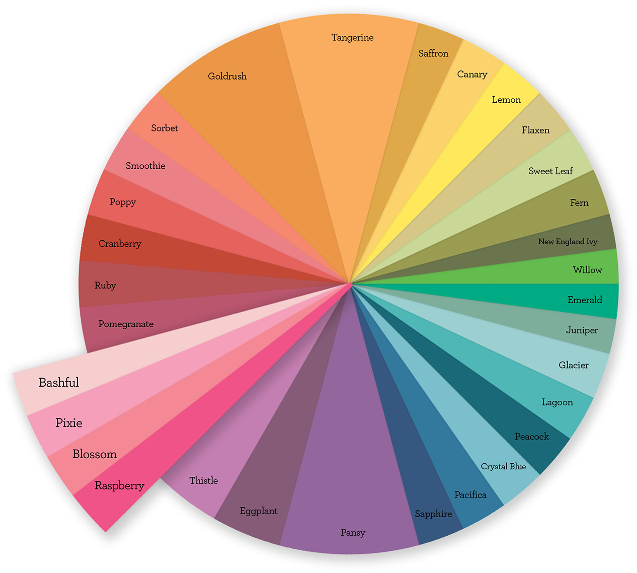
If we visit our CTMH-color-wheel, you can see that the four colors we used throughout our layout, Bashful, Pixie, Blossom, and Raspberry, are all adjacent to each other. (As a reminder, we have our Pretty in Pink sale going on through the end of the month where you can find products in these colors at a discount!) This layout would’ve worked in much the same way with Sapphire, Pacifica, Crystal Blue, and Peacock….
…The end goal is to know how to,…,create beautiful art worthy of preserving your memories.
So, here’s what you need from this post for your color scheme toolbox: when you’re choosing colors for your artwork, start at the color wheel. Pick a dominant color and then look at the colors around it. Make use of these colors with your papers, inks, Complements, and accessories and you can’t go wrong!” 🙂
For the original MIFYH Blog post or the artwork recipes, click here.
For more color combination ideas revisit last month’s color theory post:
Complementary Colors and How to Use Them
Happy Crafting! Beth

